Using Color Psychology in Print Marketing
If you think color is just a visual element in print marketing, think again. Studies have shown that a staggering 62 to 90 percent of consumers base their product assessments on color alone. The impact that colors have on our emotions and actions is undeniable, and understanding color psychology can be a game-changer for businesses when it comes to creating effective print marketing materials.
Key Takeaways:
- Color plays a significant role in consumer decision-making, with up to 90 percent basing their product assessments on color alone.
- Understanding color psychology enables businesses to create powerful and impactful print marketing materials.
- Choosing the right color combinations can evoke specific emotions and resonate with the intended audience.
- Color choices should align with the brand’s message and target audience preferences to increase effectiveness.
- By harnessing the power of color psychology, businesses can enhance their brand messaging and drive action.
The Importance of Color Psychology
Color psychology plays a crucial role in print marketing, as different colors have the power to evoke various emotions and reactions. By understanding the impact of colors on human psychology, businesses can strategically utilize color to create compelling print marketing materials that resonate with their target audience.
Color meanings and color symbolism vary across cultures and individuals, making it essential for businesses to consider the context and demographics of their audience. For example, the fast-food chain McDonald’s uses the colors red and yellow in their branding to trigger hunger and happiness. This effective use of color psychology influences their target market to make quick and impulsive purchasing decisions.
By harnessing the basics of color psychology, businesses can create meaningful associations with their brand and communicate their intended message more effectively. Each color carries its own connotations and elicits specific emotional responses. For instance, red is commonly associated with excitement and urgency, while blue evokes a sense of calmness and trust.
- Red: Represents passion, energy, and urgency.
- Yellow: Symbolizes happiness, optimism, and creativity.
- Blue: Conveys trust, reliability, and serenity.
- Green: Represents growth, harmony, and relaxation.
Understanding the impact of color psychology enables businesses to strategically select colors that align with their brand values and intended message. By choosing the right colors for their print marketing materials, businesses can create an emotional connection with their target audience, evoke desired responses, and enhance their overall brand perception.
Color Psychology Basics
Understanding color psychology is essential when it comes to creating impactful print marketing materials. Colors have psychological triggers deeply rooted in biology and cultural associations, eliciting different emotional responses from individuals.
For instance, the color red is often associated with excitement and urgency. It can grab attention and stimulate action. On the other hand, green represents hope and relaxation, evoking a sense of calmness and tranquility. By incorporating these basic color associations into print designs, businesses can tap into the emotional responses of their target audience.
When choosing colors for print marketing materials, it’s important to consider how they align with the intended messaging and desired emotional impact. By strategically selecting colors based on color psychology principles, businesses can create a powerful visual language that resonates with their audience.
Color psychology goes beyond the surface level; it taps into the subconscious mind and influences consumer behavior. Implementing the right colors in print marketing materials can evoke specific emotions and trigger psychological responses, ultimately driving the desired actions from the audience.
Next, we will explore how color combinations impact the effectiveness of print design, and how businesses can create visually appealing materials that leave a lasting impression.
Color Combinations for Effective Print Design
A successful color scheme in print design typically involves three main colors: a base color, an accent color, and a neutral color. By carefully selecting and combining these colors, businesses can create print materials that leave a lasting impression on their audience.
Monochromatic schemes are a popular choice in print design as they emphasize the meaning of the base color. In this scheme, different shades and tones of a single color are used to create a harmonious and cohesive look. This creates a sense of unity and simplicity, making it a versatile choice for various design applications.
Analogous schemes utilize colors that are adjacent to each other on the color wheel. This creates a harmonious and balanced effect, as the colors share similar undertones. Analogous color combinations are effective in evoking a specific mood or emotion, such as using warm tones of red, orange, and yellow for a vibrant and energetic design.
Complementary schemes involve using colors that are opposite each other on the color wheel. This creates a dynamic and stimulating design that naturally catches the viewer’s attention. By combining contrasting colors, businesses can create a visually striking effect and grab the audience’s interest. For example, pairing blue and orange or purple and yellow can create a compelling and vibrant design.
Triadic schemes draw from three different sections of the color wheel, forming an equilateral triangle. This combination creates a balanced and pleasing look, as the colors are evenly spaced apart. Triadic color schemes offer a wide range of possibilities and can create visually interesting designs. For example, combining red, yellow, and blue can create a primary color scheme that is bold and eye-catching.
When selecting color combinations for print design, it’s important to consider the emotional impressions you want to evoke in your audience. Colors have the power to influence emotions and perceptions, so choose combinations that align with your brand and message. Experiment with different color schemes to find the ones that resonate with your target audience and effectively convey your desired emotional impact.
Benefits of Choosing the Right Color Combinations
- Creates a visually appealing and cohesive design
- Evokes specific emotions and responses in the audience
- Grabs the viewer’s attention and engages them with the content
- Reinforces brand identity and message
- Sets the tone and mood of the printed materials
Using Color in Print Marketing
When it comes to print marketing, color selection plays a crucial role in conveying the intended feeling and message. The use of color can evoke specific emotions and reactions in the target audience, making it an essential consideration in effective marketing strategies. By understanding color psychology and its impact on marketing, businesses can create visually appealing and impactful print materials that resonate with their audience.
Appealing to intelligence and reliability: For philanthropic support campaigns or materials aimed at conveying trust and dependability, colors such as blues, browns, and grays can be used. These colors evoke a sense of intelligence and reliability, making them suitable for conveying information and appealing to an audience seeking credibility in their decision-making process.
Targeting specific audiences: Varying colors can be utilized to target specific demographic groups. For example, using purples, pinks, and whites in print materials can attract a feminine audience. These colors are associated with femininity, grace, and elegance. By understanding the preferences of the target audience, businesses can create customized print materials that effectively resonate with their intended demographic.
Creating a sense of urgency and highlighting seasonal themes: Color can also be used to create a sense of urgency or emphasize seasonal themes in print marketing materials. Bright and vibrant colors can capture attention and create a sense of immediacy, encouraging the audience to take action. Additionally, aligning colors with seasonal themes, such as using warm tones in autumn or cool blues in summer, can enhance the relevance and impact of the print materials.
Aligning with brand identity: Selecting the right colors for print marketing materials requires careful consideration of the brand identity. Colors should align with the brand’s personality and values to establish a consistent visual identity. By selecting colors that resonate with the brand and its target audience, businesses can create a cohesive and impactful brand experience across their print materials.
When using color in print marketing, it is essential to remember that different colors have different psychological effects. By understanding the impact of color selection and utilizing it strategically, businesses can enhance the effectiveness of their print marketing campaigns and create a lasting impression on their target audience.
Considerations for Print Material Design
When designing print materials, it is crucial to consider the target audience and their preferences. Different colors can have a profound impact on attracting specific audiences and eliciting desired responses. For instance, restaurants organizing singles night events may opt for colors that depict passion and love in their flyers. On the other hand, family-oriented events could benefit from the use of blues, yellows, and greens to create a welcoming and inclusive atmosphere.
To create an effective design, it is essential to develop a color palette that complements the brand and aligns with the desired emotional impact. By selecting colors strategically, businesses can create print materials that resonate with the target audience and convey the intended message. This careful consideration of the color palette can significantly enhance the overall impact and effectiveness of the print materials.
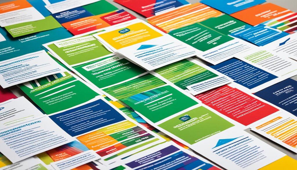
By understanding the audience’s preferences and utilizing appropriate colors, businesses can create powerful and visually appealing print materials that capture attention and drive action. A well-designed color palette can evoke emotions, establish brand identification, and convey key messages to the target audience in a compelling manner. With a thoughtful balance of colors, businesses can maximize the impact of their print materials and enhance their overall marketing efforts.
The Power of Seasonal Color Choices
When it comes to print marketing, the use of color can have a powerful impact on the effectiveness of your materials. One strategy that can help businesses stay relevant and connect with their target audience is to match the colors in their print marketing materials to the seasons.
Seasonal color choices allow businesses to tap into the mindset and desires of consumers during different times of the year. For example, bright colors like yellows and pinks can be used in summer designs to evoke feelings of warmth and vibrancy. On the other hand, blues and whites work well in winter themes, conveying a sense of tranquility and elegance.
By aligning the colors in your print marketing materials with the seasons, you can create a visual association that resonates with your target audience. When consumers see colors that reflect the time of year they are in, it can create a sense of relatability and make your brand more memorable.
Seasonal color choices can also help create a sense of urgency or highlight specific promotions and offers. For example, using warm and inviting colors in your fall-themed marketing materials can evoke feelings of coziness and prompt customers to take advantage of limited-time deals.
When selecting colors for seasonal marketing, it’s essential to consider the emotions and associations that different colors evoke. For each season, choose colors that align with the overall mood and atmosphere you want to create.
By harnessing the power of seasonal color choices in your print marketing materials, you can create visually appealing and impactful campaigns that resonate with your target audience, enhance brand messaging, and drive action.
Maximizing Color Effects in Print Design
Achieving maximum color effects in print design requires a thoughtful approach to color pairing and a thorough understanding of color theory. By strategically selecting and combining colors, businesses can create visually stunning and impactful print materials. Utilizing white as a base color can provide stability and balance in designs that incorporate a variety of colors.
Complementary color pairs, which involve using colors opposite each other on the color wheel, can create maximum contrast and visual harmony. This pairing technique enhances the overall stability and impact of the design. When complementary colors are used effectively, they can create a visually striking composition that captures the viewer’s attention.
Online color tools such as Coolors.co can be valuable resources for finding the best color combinations for print design. These tools can help designers and marketers explore various color palettes, experiment with different shades and tones, and identify harmonious color schemes that align with their brand or message. Using these tools can save time and ensure that the chosen color combinations are visually appealing and impactful.
When considering color combinations for print design, it’s important to take into account the context and purpose of the materials. Different color combinations can evoke specific emotions and convey different messages. By understanding the psychological and emotional associations of colors, designers can select color combinations that effectively communicate the desired message and resonate with the target audience.
By maximizing color effects in print design through careful color pairing and utilizing color theory, businesses can create visually compelling and impactful print materials that leave a lasting impression on their audience. The right color combinations can evoke the desired emotions and strengthen the overall message of the design, enhancing the effectiveness of the print marketing campaign.
Attracting Your Intended Audience with Color
The colors used in print materials play a crucial role in attracting your intended audience. Different colors evoke different emotions and resonate with specific demographics. Understanding your target audience’s preferences and using colors that align with their interests can significantly increase the effectiveness of your print marketing materials.
When selecting colors for your print materials, it’s important to consider the psychological impact they have on your audience. For example, using warm colors like red, orange, and yellow can create feelings of excitement and energy, while cool colors like blue and green can evoke a sense of calmness and trust. By strategically selecting colors that resonate with your target audience, you can create a stronger connection and increase the likelihood of capturing their attention.
In addition to color selection, the choice of print materials can also influence how your audience perceives your brand. High-quality materials can convey professionalism and reliability, while unique textures or finishes can create a sense of luxury or exclusivity. By considering both color and print materials, you can create a cohesive visual experience that aligns with your brand and appeals to your target audience.
Themed Templates and Customizable Designs for Audience Targeting
Creating visually appealing print materials for specific audiences can be made easier with themed templates or customizable designs. Platforms like MyCreativeShop provide a wide range of templates that are tailored to different industries and target markets. These templates have already taken into account the psychology of color and are designed to attract the intended audience.
By leveraging themed templates, you can save time and effort in designing your print materials while ensuring that they are visually appealing and effective. Additionally, customizable designs allow you to personalize the templates to match your brand and messaging, making them even more impactful in attracting your intended audience.
Once you have selected a template or customized design, you can further enhance the visual appeal of your print materials by incorporating high-quality images. Images can reinforce the emotions and messages conveyed by the colors, creating a more immersive and engaging experience for your audience.
Remember, attracting your intended audience with color is a blend of art and science. By understanding the psychological impact of color, selecting the right print materials, and utilizing themed templates or customizable designs, you can create print marketing materials that effectively target your audience and drive meaningful results.
Harnessing the Power of Color Psychology in Print Marketing
Color psychology plays a crucial role in the success of print marketing efforts. By understanding the emotions and reactions associated with different colors, businesses can create captivating and engaging print materials that leave a lasting impact on their target audience. When used strategically, color has the power to elicit specific responses and drive action.
Effective print marketing leverages color to convey messages, evoke emotions, and create associations. For example, using warm colors like red and orange can create a sense of urgency and excitement, while cool colors like blue and green can instill a feeling of calmness and trust. By selecting colors that align with their intended message and target audience, businesses can create a powerful visual language that resonates with their customers.
One effective way to utilize color psychology in print marketing is through color combinations. Certain color pairings can create harmony, contrast, or evoke specific emotions. For instance, pairing complementary colors like blue and orange can create a vibrant and attention-grabbing design, while analogous colors like green and yellow can create a soothing and harmonious visual experience. By understanding the principles of color theory and experimenting with different color combinations, businesses can maximize the impact of their print materials.
To illustrate an example, let’s imagine a company promoting a summer sale. By using vibrant and warm colors like yellow and pink, they can evoke feelings of happiness, enthusiasm, and energy, which are synonymous with the summer season. This color choice not only captures the attention of the target audience but also aligns with the context of the promotion, increasing its effectiveness.
Furthermore, when designing print materials, it’s important to consider the intended audience. Different colors have varying effects on different demographic groups. For instance, bright and bold colors may be more appealing to a younger audience, while muted and sophisticated colors may resonate better with an older demographic. By carefully selecting colors that align with the preferences and characteristics of the target audience, businesses can create print materials that effectively communicate their message and foster a connection with their customers.
Using color psychology in print marketing is not limited to color selection alone. It also extends to the careful use of imagery. By incorporating relevant images that resonate with the brand and message, businesses can further enhance the impact of their print materials. For instance, including an image of people enjoying a product or service can create an emotional connection with the audience, reinforcing the desired response.
In conclusion, understanding and harnessing the power of color psychology in print marketing can significantly enhance the effectiveness of promotional materials. By selecting the right colors, employing strategic color combinations, and considering the targeted audience, businesses can create visually appealing and impactful print materials that drive action and leave a lasting impression.
Conclusion
Color psychology plays a crucial role in effective branding and print marketing. By understanding the impact and meaning behind colors, businesses can create powerful and captivating print materials that resonate with their target audience. Utilizing the psychological triggers of color, businesses can evoke specific emotions and reactions that align with their brand messaging.
When selecting colors for print marketing campaigns, it is essential to consider the intended audience and the message being conveyed. Each color has its own associations and connotations, which can greatly impact how a brand is perceived. By strategically choosing appropriate color combinations and considering the emotions they evoke, businesses can enhance their branding efforts and leave a lasting impression on their audience.
Effective branding through color psychology extends beyond just the selection of colors. It also involves using color combinations that create visual harmony and convey the desired message. Whether it’s through monochromatic, analogous, complementary, or triadic schemes, businesses can create visually appealing print designs that effectively communicate their brand identity and values.
By leveraging color psychology in print marketing, businesses can differentiate themselves from competitors and create a strong brand presence. Understanding the basics of color psychology and incorporating it into print materials allows businesses to connect with their target audience on an emotional level, ultimately increasing brand recognition and driving action.
FAQ
What role does color psychology play in print marketing?
Color psychology plays a significant role in print marketing, as it can evoke specific emotions and reactions, influencing consumer behavior.
How do colors impact emotions and actions?
Different colors evoke different emotions and reactions. Understanding the basics of color psychology can help businesses create meaningful associations with their brand.
What are some basic color associations?
Each color has different emotional connotations. For example, red is associated with excitement and urgency, while green represents hope and relaxation.
What are some effective color combinations for print design?
A successful color scheme typically involves a base color, an accent color, and a neutral color. Different color combinations can evoke specific emotional impressions.
How should businesses choose colors for their print marketing materials?
Businesses should select colors that align with their brand and resonate with their target audience. Colors should match the intended feeling and message of the marketing materials.
How can businesses tailor print material design to their target audience?
Different colors can attract different audiences and elicit specific responses. It’s important to create a color palette that complements the brand while considering the desired emotional impact and preferences of the target audience.
How can businesses utilize seasonal color choices in print marketing?
Matching the colors in print materials to the seasons can help businesses stay relevant and connect with their target audience. Different colors can evoke the mindset and desires of consumers during different seasons.
What are some tips for maximizing color effects in print design?
Careful color pairing and understanding color theory are essential. Utilizing white as a base color can create stability, and complementary color pairs can create maximum contrast and stability.
How can businesses attract their intended audience with color in print marketing?
Different colors resonate with different demographics. Understanding the target audience’s preferences and using colors that align with their interests can increase the effectiveness of print marketing materials.
How important is color psychology in print marketing?
Color psychology plays a crucial role in print marketing, as it can significantly impact the success of marketing efforts. By understanding how colors evoke emotions and reactions, businesses can create captivating and engaging print materials that resonate with their audience.
Source Links
- https://www.mycreativeshop.com/learn/color-psychology-for-print-marketing-what-you-need-to-know
- https://www.rightbydelzer.com/color-psychology-in-print-marketing/
- https://www.quora.com/What-impact-does-color-psychology-have-on-the-printing-industry-and-how-can-businesses-use-this-knowledge-to-create-effective-marketing-materials

