How to Design Brochures that Stand Out
Did you know that brochures have become an essential marketing tool for businesses, with 79% of consumers saying they find brochures helpful when making purchasing decisions? With such a high impact, it’s crucial to design brochures that not only capture attention but also effectively convey your message to your target audience. In this article, we will provide valuable tips and strategies for designing effective brochures that stand out from the competition.
Key Takeaways:
- Incorporate unique physical elements like unusual folding techniques or unexpected inserts to make your brochure visually stimulating and attention-grabbing.
- Experiment with unconventional shapes, breaking out of the traditional box shape, to create a memorable and eye-catching design.
- Enhance the visual appeal and impact of your brochures by using creative fold formats such as tri-fold or accordion-style folds.
- Improve usability and navigation by adding tabs to your brochure along with striking typography and color.
- Use cut-cuts or die-cuts to add visual interest and depth to your brochure design, making it more visually appealing and memorable.
Think Outside the Box with Physicality
When it comes to designing brochures that truly stand out, incorporating unique physical elements can make a significant impact. By thinking outside the box and exploring creative brochure layout best practices, you can create a visually stimulating and captivating brochure that captures the reader’s attention.
Utilize Unusual Folding Techniques
One effective way to enhance the physicality of your brochure is by utilizing unusual folding techniques. Instead of sticking to traditional fold formats, consider experimenting with unconventional folds such as gate folds, accordion folds, or even origami-inspired folding. These creative approaches can add intrigue and surprise to your brochure’s layout, making it more memorable and enticing for the reader.
Play with Paper Sizes
Another way to make your brochure design more eye-catching is by playing with different paper sizes. Instead of using standard letter-size or A4 sheets, consider using larger or smaller sizes to create a sense of uniqueness. Oversized brochures can create a bold and impactful impression, while smaller brochures can feel more intimate and exclusive.
Include Unexpected Inserts
To further enhance the physicality of your brochure, consider incorporating unexpected inserts. These could be pop-up elements, removable cards, or even interactive elements like scratch-off sections or hidden compartments. These surprise elements add an extra layer of engagement to your brochure, making it more interactive and memorable for the reader.
By incorporating these brochure layout best practices and exploring creative brochure design ideas, you can create visually stunning and engaging brochures that leave a lasting impression. Embrace physicality and think outside the box to make your brochures stand out from the crowd.
Experiment with Unconventional Shapes
When it comes to designing brochures, most people tend to stick with the traditional square or rectangular shape. However, by thinking outside the box and utilizing unconventional shapes, you can create a brochure that truly stands out from the competition.
Breaking away from the traditional box shape allows you to capture the reader’s attention and make a lasting impression. By opting for unique shapes that align with your brand and message, you can create a brochure that not only stands out visually but also reinforces your branding. This approach can greatly enhance the overall marketing potential of your brochure.
Consider using shapes that are relevant to your business or industry. For example, if you are designing a brochure for a fitness center, you could consider a brochure shaped like a dumbbell or a running shoe. This not only makes the brochure visually appealing but also instantly communicates the nature of your business.
To further emphasize the effectiveness of unconventional shapes in brochure design, let’s take a look at an example:
Example:
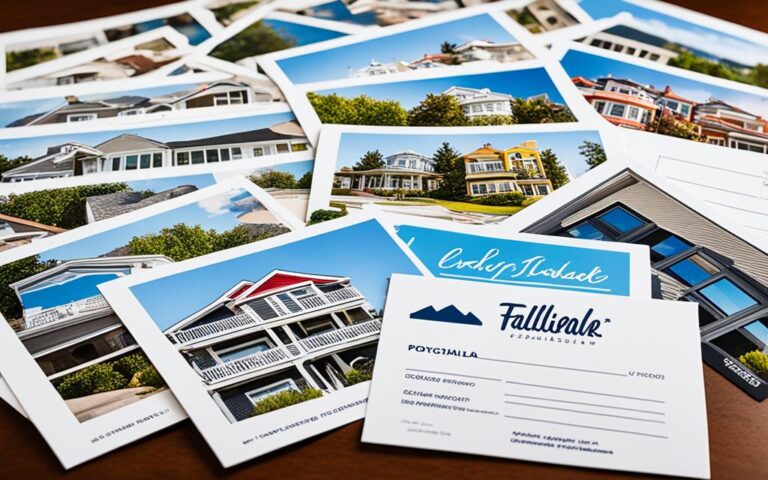
In this example, a real estate company called “Dream Homes” designed a brochure in the shape of a house. The unique shape instantly grabs attention and aligns perfectly with their branding. It not only highlights their professional brochure design but also reinforces their commitment to helping people find their dream homes. The unconventional shape, combined with compelling content, makes this brochure highly effective in capturing the reader’s interest.
Incorporating unconventional shapes in your brochure design allows you to break free from the ordinary and create a memorable impact on your audience. When combined with effective brochure content and professional design elements, these unique shapes contribute to a visually appealing and engaging brochure that sets you apart from the competition.
Enhance with Creative Fold Formats
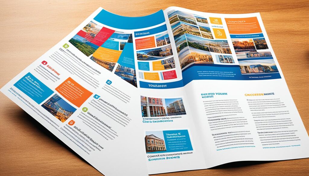
The fold format of a brochure plays a crucial role in its overall visual appeal. The way you fold your brochure can make it stand out from the rest and captivate your audience. By experimenting with different fold formats, such as tri-fold brochures or unique accordion-style folds, you can create a brochure that surprises and engages the reader.
A tri-fold brochure, for example, offers multiple panels that can be used to showcase key information in an organized and visually appealing manner. The unique accordion-style fold, on the other hand, allows for creative storytelling and the gradual reveal of content as the reader unfolds the brochure.
When thinking about creating high-impact brochures, brochure design inspiration can come from exploring various fold formats. Don’t be afraid to think outside the box and come up with innovative ways to present your content. Consider how the folding technique can enhance your messaging and make your brochure more memorable.
By incorporating creative fold formats, you can increase the impact of your brochures and leave a lasting impression on your audience. The unexpected nature of the fold will surprise and engage readers, drawing them further into your content. This unique approach to brochure design will make your brochures stand out and capture the attention of potential customers.
Use Tabs for Better Navigation
When designing a brochure, it’s crucial to consider the user experience and make it easy for readers to navigate through the content. One effective way to enhance the usability of your brochure is by incorporating tabs.
By adding tabs to your brochure, you provide readers with a clear visual hierarchy and make it effortless for them to access different sections or categories of information. Tabs allow for easy navigation, ensuring that important details don’t get lost amidst the content.
When implementing tabs in your brochure design, it’s essential to combine them with striking typography and color choices. This enhances the visual appeal of your brochure, capturing readers’ attention while also facilitating easy identification and selection of tabs.
Additionally, by utilizing strategic tab placement and labeling, you can guide readers through your brochure, fostering a seamless browsing experience. Sections labeled with succinct and descriptive titles enable readers to find the information they need quickly and efficiently.
Overall, incorporating tabs into your brochure design improves both the visual aesthetics and user experience. It ensures that readers can easily navigate the content, accessing the necessary information effortlessly. By employing this effective navigation technique, your brochure becomes more engaging and user-friendly.

Benefits of Using Tabs in Brochures
- Enhances brochure usability and navigation
- Creates a clear visual hierarchy
- Facilitates easy access to different sections or categories of information
- Captures readers’ attention with striking typography and color choices
- Guides readers through the brochure, leading to a seamless browsing experience
By incorporating tabs in your brochure design, you can improve the overall effectiveness of your content by making it more accessible and user-friendly.
Incorporate Cut-Cuts and Die-Cuts
One way to add visual interest and create unique shapes in your brochure design is by incorporating cut-cuts and die-cuts. These techniques allow you to create intriguing cut-outs and add depth to your brochure, making it visually appealing and memorable for your audience.
By strategically placing cut-cuts or utilizing die-cutting techniques, you can create eye-catching designs that capture attention. For example, you can create cut-outs in the shape of your company logo or relevant images that align with your branding. These cut-outs can be strategically placed to reveal important information or create visual interest.
Creative layout design plays a crucial role in maximizing the impact of cut-cuts and die-cuts. By pairing these techniques with a well-thought-out layout, you can create a harmonious and visually appealing brochure that effectively conveys your message.
When incorporating cut-cuts and die-cuts, it’s important to consider the overall design and readability of your brochure. The cut-outs should enhance the design without compromising the readability of the content. Balancing creativity with functionality is key to creating a professional brochure design that stands out.
Enhancing Brand Identity
In addition to adding visual interest, cut-cuts and die-cuts can also contribute to reinforcing your brand identity. By incorporating unique shapes and cut-outs that align with your brand’s visual elements, you can create a cohesive design that strengthens brand recognition.
For example, if your brand has a distinct logo or symbol, incorporating a die-cut of that shape into your brochure can create a memorable and impactful design. The distinct shape will evoke brand association and make your brochure instantly recognizable to your target audience.
Remember to consider the printing and production process when incorporating cut-cuts and die-cuts into your brochure design. Consult with professional printing services to ensure that your design is properly executed and the cut-out elements are precise and clean.
Incorporating cut-cuts and die-cuts into your brochure design elevates its visual appeal and creates a lasting impression on your audience. By combining these techniques with creative layout design and reinforcing your brand identity, you can achieve a high-quality, professional brochure that effectively communicates your message.
For more information on how to utilize cut-cuts and die-cuts in brochure design, you can visit this resource. It provides insights and techniques to help you create visually stunning and impactful brochures.
Choose Unique Binding Methods
The binding method you choose for your brochure plays a crucial role in its overall design and impact. While traditional saddle-stitch binding may be the go-to option, considering unconventional binding methods can add a touch of creativity and uniqueness to your brochure design, making it more visually appealing and engaging.
Instead of sticking to the ordinary, explore options like spiral binding or other innovative techniques that are less commonly used. These unconventional binding methods can help your brochure stand out from the rest, catching the viewer’s attention and making a lasting impression.
If you want to showcase your brand’s creativity and distinguish yourself from competitors, embracing unique binding methods is a great way to do it. Think outside the box and experiment with different binding techniques to create a brochure that truly captivates your audience.
To learn more about different types of brochure bindings and their benefits, visit this article.
Keep it Consistent with Branding
When designing effective brochures, it’s crucial to maintain consistency with your branding. Consistency in design elements, such as colors, fonts, and imagery, helps reinforce your brand identity and creates a cohesive experience for the reader. By aligning your brochure design with your company’s branding and message, you can effectively communicate your values and differentiate yourself from competitors.
One important aspect of professional brochure design is to ensure that the overall style of the brochure reflects your brand’s personality and target audience. For example, if your brand is known for being modern and minimalist, incorporating clean lines and simple typography in your brochure design would be a good fit. On the other hand, if your brand is more playful and creative, consider using vibrant colors and unique graphic elements to capture attention.
An essential consideration when designing brochures is to be mindful of your target audience. Understanding their preferences, needs, and expectations will allow you to create a brochure that resonates with them. For instance, if your target audience consists of professionals in a specific industry, your brochure design should showcase professionalism and expertise to instill trust and credibility.
By keeping your brochure design consistent with your branding, you convey a strong visual message that reinforces your brand’s identity and helps build brand recognition. The look and feel of your brochure should align with your other marketing materials, such as your website and business cards, to create a unified brand experience for your audience.
Connect with your audience through consistent design
Consistency in design elements not only enhances brand recognition but also helps establish a connection with your audience. When readers encounter your brochure, they should be able to easily identify and associate it with your brand. This familiarity builds trust and encourages engagement with your content.
One way to achieve consistency is by using the same color palette, fonts, and imagery across all marketing materials, including brochures. This creates a sense of coherence and professionalism that resonates with your audience and reinforces your brand’s authenticity.
Another crucial aspect of maintaining consistency is to ensure that the tone and messaging in your brochure align with your overall brand voice. Whether your brand is casual, formal, or somewhere in between, your brochure should use language and imagery that reflect this tone. This consistency helps establish a connection between your brand and your audience, making your brochure more relatable and persuasive.
Overall, designing effective brochures requires careful attention to detail and alignment with your branding. By incorporating consistent design elements and messaging, you can create brochures that effectively convey your brand’s message, capture attention, and leave a lasting impression on your target audience.
For more insights on designing high-impact brochures, check out this LinkedIn article on common design challenges when creating brochures. It provides valuable tips and strategies to help you overcome design obstacles and create brochures that effectively communicate your message. Remember, a well-designed brochure that aligns with your branding can be a powerful marketing tool that sets you apart from your competitors.
Conclusion
In conclusion, mastering the art of professional brochure design requires a creative mindset, strategic thinking, and meticulous attention to detail. By incorporating unique physical elements, such as innovative folding techniques and unconventional shapes, you can create brochures that immediately capture attention and leave a lasting impression.
Remember to keep your design consistent with your branding to maintain a cohesive and impactful message. Additionally, prioritize user-friendliness by utilizing tabs for easy navigation and ensuring that important information is readily accessible.
By following these brochure design tips and thinking outside the box, you can create high-impact brochures that effectively captivate and persuade your target audience. So go ahead, unleash your creativity, and design brochures that stand out from the crowd.
FAQ
How can I design brochures that stand out?
To design brochures that stand out, you can incorporate unique physical elements, experiment with unconventional shapes, use creative fold formats, add tabs for better navigation, incorporate cut-cuts and die-cuts, choose unique binding methods, and keep the design consistent with your branding.
What are some unique physical elements I can incorporate in my brochure design?
Some unique physical elements to incorporate in your brochure design are unusual folding techniques, large or small paper sizes, and unexpected inserts.
How can I create a memorable and eye-catching brochure design?
You can create a memorable and eye-catching brochure design by using unconventional shapes that break out of the traditional box shape.
What are some creative fold formats I can use in my brochure design?
Some creative fold formats you can use in your brochure design are tri-fold brochures and unique accordion-style folds.
How can I improve the usability and navigation of my brochure?
You can improve the usability and navigation of your brochure by incorporating tabs along with striking typography and color.
How can I add visual interest to my brochure design?
You can add visual interest to your brochure design by incorporating carefully-designed cut-cuts or die-cuts that create unique shapes and cut-outs.
What are some unique binding methods I can choose for my brochure?
Instead of traditional saddle-stitch binding, you can choose spiral binding or other unconventional binding methods to add creativity and uniqueness to your brochure design.
Why is it important to keep the design consistent with branding?
Keeping the design consistent with branding helps create a cohesive and impactful brochure that effectively communicates the company’s message to the reader.
What are some tips for designing effective brochures?
Some tips for designing effective brochures include incorporating unique physical elements, using unconventional shapes, experimenting with creative fold formats, adding tabs for better navigation, incorporating cut-cuts and die-cuts, choosing unique binding methods, and keeping the design consistent with branding.


